
PLAsTiCC Astronomical Classification - Light Curve Sequence Analysis
Index
- Project Overview
- Data Description
- Exploratory Data Analysis
- Feature Engineering
- Machine Learning
- Closing Thoughts
Project Overview
This is the second project for my senior year independed study, and I chose the PLAsTiCC Astronomical Challenge on Kaggle because the subject matter is fascinating and it presents an opportunity for me to practice analyzing and making predictions from time series data.
The data for the project is simulated data from the Vera C. Rubin Observatory (LSST), which has a ten year mission to survey the southern sky in 2022 with a goal of classifying celestial object. The data was released in anticipation of this project to kick off the process of understanding how to transform the observed information into a labeled map of the sky.
I had initially tested two project approaches, time series analysis with a Long Short Term Memory recurrent neural network in PyTorch and gradient boosted trees with XGBoost. I quickly determined that not only was the boosted tree model more effective, it was also much more computationally efficient.
This report details my process of understanding what the data represents, performing an exploratory data analysis, creating engineered features and evaluating them, and building the XGBoost model and optimizing it.
Unlike the Kaggle challenge for this dataset, where the goal is to ensemble many models and throw massive computational power at the problem for small incremental gains, I approached this as a business problem where the priority is speed of development, efficient training and deployment, and evaluation metrics that can be explained to a lay-person. I do think it would be fun to work alongside a subject matter expert and build an extremely high-performance ensemble model.
Data Description
The data itself consists of two CSV files. There is a metadata dataset that contains information about each object in the sky, including:
object_is- The unique ID number of each celestial object.- Location (all in degrees) - This may be an important feature for land-based observations because the density of the atmosphere that light must pass through changes based on an object’s position in the sky.
ra,decl- right ascension, declinationgal_l,gal_b- galactic longitude and latitude
ddf- A boolean value repredenting “deep drilling field,” a more accurate observation than WFD or “wide-fast-deep”. These are the two modes of observation.- Redshift - As objects move at higher speeds away from us, the doppler effect stretches out wavelengths to make the color appear more red. Due to the expansion of space, the further away from us an object is the faster it is accelerating away from us. This biases observations and must be accounted for.
hostgal_specz- Redshift calculated from spectroscopic experiments. This is difficult from land-based telescopes, but very accurate. This is very rare in the evaluation dataset, and though I will not be using that dataset I should come up with a strategy for dealing with observations where this data is not present or eliminate it entirely.hostgal_photoz- Potometric redshift, described by the challenge as a “proxy for hostgal_specz” with lower accuracy.hostgal_photoz_err- Error in the photometric redshift.
distmod- The absolute magnitude of the object, a logarithmic scale incorporating the brightness of an object and its distance. This corrects the luminosity of objects in the sky so that they can be compared as if they were all at the same difference from the observer. This feature will likely be critical as the time series data we are analyzing is the luminosity of celestial objects over time.mbwev- Extinction of light as it passes through the milky way. The milky way contains dust that can dim light or exaggerate its redshift.target- The target class. These are objects in a state of change, such as red drawrf stellar flares or eclipsing binary stars. They are giving off variable amounts of light, leading to the challenge of identifying objects by a time series representing luminance as a function of time.
The second CSV contains the meat and potatoes of the data, the time series. There is a one-to-many relationship between the metadata and the time series data. Each row in this dataset represents one observation, and when grouped by time they represent time series for individual objects. The features are:
object_id- Matches the same variable in the metadata.mjd- Modified Julian Date, the number of days since noon on November 17th, 1858.passband- Optical filters that restrict the light coming through based on wavelength. Here they are integers, each representing a standard filter.flux- The intensity of the light. As a wide field survey telescope, the LSST doesn’t capture high resolution images of tight areas but rather takes a 3 gigapixel snapshot of the sky. Instead of image recognition, the goal is to identify all objects in the night sky based on other attributes such as intensity. Unlike brightness, flux is affected by distance. In this dataset, flux is a result of image subtraction analysis.detected- The LSST project uses image subtraction analyis, where images are subtracted from a reference template and convolved with a decorrelation kernel. This is a field of study in itself and the implementation writeup is an interesting read, but in essence this boolean represents high variance between pixels after this process has been applied. Objects are added to this dataset if there have been a minimum of two detections, and they can represent a portion of a light curve where something interesting is happening.
Exploratory Data Analysis
The Metadata
First I want to take a look at the target classes and see how balanced they are.
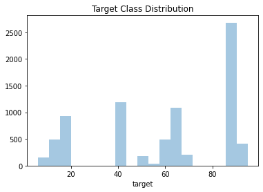
Figure 1: Target class distribution.
There are a few classes with very low representation, which might be a big deal with this limited dataset. The most populous class, 90, has 2,313 examples, while the least populous has only 30.
Next I’m going to look at missing data. There is no missing data in the light curve data, but there is one feature in the metadata with nearly 30% missing: distmod.
df_meta.isnull().sum()/len(df_meta)
object_id             0.000000
ra                    0.000000
decl                  0.000000
gal_l                 0.000000
gal_b                 0.000000
ddf                   0.000000
hostgal_specz         0.000000
hostgal_photoz        0.000000
hostgal_photoz_err    0.000000
distmod               0.296254
mwebv                 0.000000
target                0.000000
This is a pretty big gap in the data, and it needs to be dealt with. This is the distance modulus, which corrects the luminosity of objects to make them appear from a unified frame of reference. (Keep in mind that our main feature in the light curves is flux, not luminosity, and is the result of difference analysis.) Let’s investigate to see if there are any anomalies where distmod is missing.
df_meta.drop(['ra','decl','gal_l','gal_b'], axis=1)[df_meta.distmod.isnull()].sample(10, random_state=RANDOM).to_markdown()
(In case you didn’t know, Pandas dataframes have a to_markdown() method and it’s very convenient! This entire website is built in Markdown.)
| object_id | ddf | hostgal_specz | hostgal_photoz | hostgal_photoz_err | distmod | mwebv | target | |
|---|---|---|---|---|---|---|---|---|
| 1947 | 315765 | 1 | 0 | 0 | 0 | nan | 0.022 | 65 |
| 2213 | 3.47837e+06 | 0 | 0 | 0 | 0 | nan | 0.01 | 16 |
| 5773 | 8.42242e+07 | 0 | 0 | 0 | 0 | nan | 0.096 | 65 |
| 4641 | 5.81764e+07 | 0 | 0 | 0 | 0 | nan | 0.065 | 65 |
| 6616 | 1.03245e+08 | 0 | 0 | 0 | 0 | nan | 0.253 | 16 |
| 2796 | 1.58587e+07 | 0 | 0 | 0 | 0 | nan | 0.021 | 16 |
| 3407 | 2.94167e+07 | 0 | 0 | 0 | 0 | nan | 0.706 | 6 |
| 1913 | 310942 | 1 | 0 | 0 | 0 | nan | 0.024 | 92 |
| 714 | 118422 | 1 | 0 | 0 | 0 | nan | 0.024 | 65 |
| 1883 | 305673 | 1 | 0 | 0 | 0 | nan | 0.006 | 65 |
A little investigation shows that everywhere distmod is missing, the redshift values are all zero. The same is true in reverse. The redshift values are tied to a host galaxy. If they are zero and there is no distmod, I’m almost positive it means that these objects are inside of our own Milky Way galaxy. I’m going to fill the NaN values for distmod to zero and add a milky_way boolean, though I’m pretty sure that XGBoost will learn this on it’s own by drawing a decision boundary at zero on this feature in a stump.
I’d also like to take a look at the correlation between the redshift features and distmod.
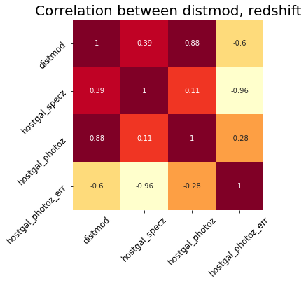
Figure 2: Correlation between redshift features and distmod.
As expected, these features are highly correlated. If I was working with any type of model besides a decision tree, I would use a dimensionality reduction strategy like Principle Component Analysis to reduce them to one or two high variance features. But I think that would be redundant with XGBoost.
Light Curve Data
Now on to the more interesting dataset, the light curves! I think the most important thing to look at is how long these are - are they uniform length (number of observations)? Are there uniform steps? Do they represent the same duration?
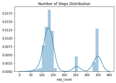
Figure 3: The distribution of number of observations per object.
The light curves have different numbers of observations, but there seems to be three clusters around 125, 250, and 330.
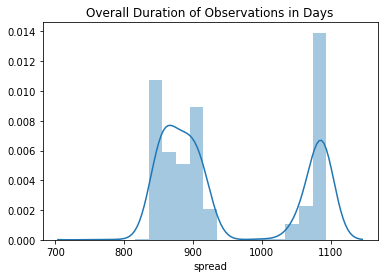
Figure 4: The distribution of observation periods in days.
There is variation here, but it seems like most of the observations take place over a period of a little over two years or three years.
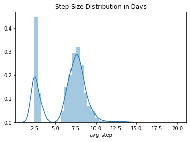
Figure 5: The distribution of average step sizes.
There also seems to be a significant amount of variation in average step size, and that the observations are taken once or twice a week.
These observations are taken with different passbands, representing different wavelengths of light. This means that there are different light curves for each passband, and when I am feature engineering I plan to split the light curve analysis on this feature.
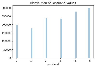
Figure 6: The distribution passbands used across all observations.
They are fairly evenly distributed. Let’s take a look at that these observations look like plotted together.
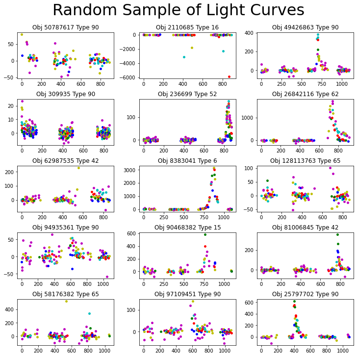
Figure 7: Random samples of light curves with passbands separated by color.
We can see that where the passbands overlap on a scale of a few hundred flux or less, there is often a clear separation along the y axis. We can also see that different passband measurements are taken on different days. This leads me to believe that analyzing the light curves separately is the way to go.
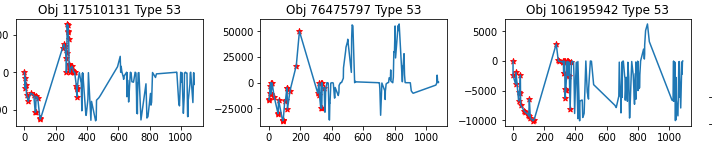
Let’s look at what these light curves actually look like. In Figure 8, each column represents a distinct object while the rows iterate through passbands.
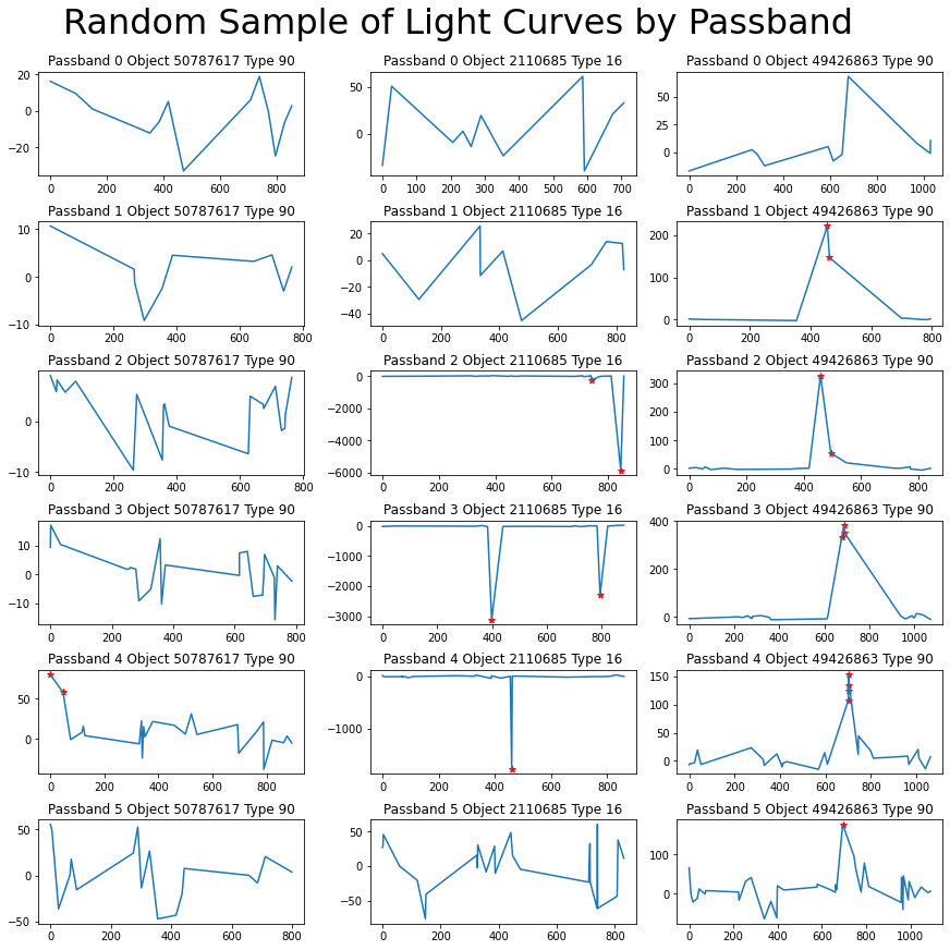
Figure 8: Three light curves (columns) separated by passband (rows). Red stars represent detections.
We can see that each curve has a unique shape and is spread over a different range. But that said, these data points are collected with days, weeks, months, or even years in between them and we aren’t looking at the full picture. This explains in part why my attempt at an sequential analysis was unsuccessful, and why extracted metadata broken down by passband such as min, max, skew, etc. has the potential to be more useful than the sequence of steps.
Let’s take one more look at the light curves, this time with the passbands combined.
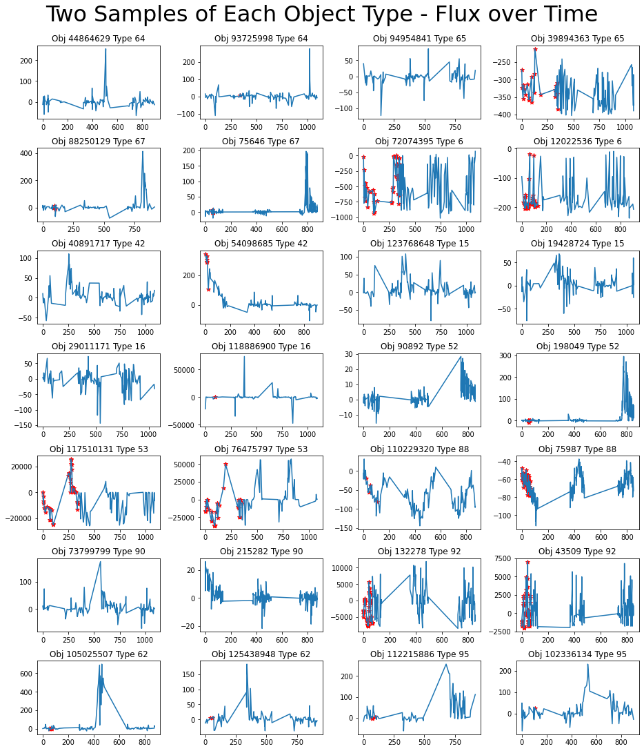
Figure 9: Two light curves over all passbands from each object type. Red stars represent detections.
99.9% of the flux values are under 9,300, but there are outliers up to 2,432,808. Figure 10 shows a graph of the empirical cumulative distribution function for flux values, with the vertical line at the 97.5 percentile mark.
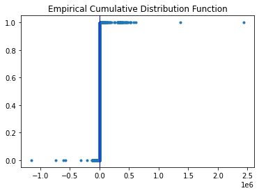
Figure 10: Empirical cumulative distribution function of flux.
These extreme outliers don’t seem to be noise, but rather predictors of classes 6, 53, and 92.
Feature Engineering
My strategy for feature engineering was to extract a handful of features for the metadata, such as milky_way and distance, and then extract a large number of descriptive statistics from the light curve data.
For the light curve data, I grouped by object_id and split the data by passband, then used Pandas aggregate to calculate these statistics.
I added new features incrementally, training an XGBoost model and returning the feature importance. The biggest shakeups were the percentiles and luminosity, which quickly dominated the top thirty list.
def q25(x):
    return sorted(list(x))[int(0.25*len(x))]

def q75(x):
    return sorted(list(x))[int(0.75*len(x))]

def q95(x):
    return sorted(list(x))[int(0.95*len(x))]

groupby_dic = {
    'flux' : ['min', 'max', 'mean', 'std', 'skew', q25, q75, q95],
    'flux_err' : ['min', 'max', 'mean', 'std', 'skew'],
    'luminosity' : ['min', 'max', 'mean', 'std', 'skew', q25, q75, q95],
    'detected' : ['count', 'mean'],
    'flux_steps' : ['mean', 'std']
}

def process_data(df, df_meta, groupby_dic ):
    df_meta.index = df_meta.object_id
    df_meta.index.name = None

    # If distmod is null, the object is local.
    df_meta['milky_way'] = df_meta.distmod.isnull()

    # Change missing distmod to zero
    df_meta.distmod.fillna(0.0, inplace=True)

    # Calculate Luminosity
    df_meta['distance'] = Distance(distmod=df_meta.distmod)
    df = df.merge(df_meta[['object_id', 'distance']], on='object_id')
    df['luminosity'] = 4 * np.pi * df.flux * df.distance
    df.drop('distance', axis=1, inplace=True)

    # Calculate flux step sizes
    df['flux_steps'] = df.groupby('object_id')['flux'].diff().fillna(0)

    # Aggregate statistics grouped on object_id and passband
    agg = pd.DataFrame(index=df_meta.object_id)
    agg['object_id'] = df_meta.object_id
    for pb in range(6):
        temp = df[df.passband==pb].groupby('object_id').agg(groupby_dic)
        temp.columns = ['pb' + str(pb) + '_' + '_'.join(c) for c in temp.columns]
        agg = agg.join(temp)
    del(temp)

    # Light curve features not in aggregate statistics
    df_meta['duration'] = df[df.detected == 1].groupby('object_id').mjd.max() - df[df.detected == 1].groupby('object_id').mjd.min()

    df_meta['total_duration'] = df.groupby('object_id').mjd.max() - df.groupby('object_id').mjd.min()

    df_meta['back_duration'] = np.abs(df.groupby('object_id').mjd.max() - df[df.detected == 1].groupby('object_id').mjd.min())

    df_meta['front_duration'] = np.abs(df.groupby('object_id').mjd.min() - df[df.detected == 1].groupby('object_id').mjd.min())

    return df_meta.object_id, df_meta.join(agg.drop('object_id', axis=1)).drop(['object_id', 'target'], axis=1), df_meta.target

_, X, y = process_data(df, df_meta, groupby_dic)

X_train, X_test, y_train, y_test = train_test_split(X, y, test_size=0.3, random_state=RANDOM)
Note: Pandas does have a built-in quantile function that would be more Pythonic, but it has exponential complexity versus my O(n log n) implementation. Total training time dropped from almost 20 minutes to 37 seconds when I changed from the Pandas implementation to the sorted list implementation above.
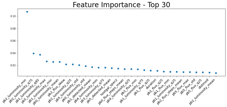
Figure 11: Top thirty most important features in the XGBoost model.
Machine Learning
Evaluation
Because this is a classification problem, I chose to evaluate it with a combination of the confusion matrix and the F1 score.
A confusion matrix is a table of truth values versus predicted values, where the diagonal represents accurate predictions and other cells represent error.
def plot_confusion_matrix(true, pred, classes, title='Confusion Matrix', figsize=(10,8), normalize='true'):
    plt.figure(title, figsize=figsize)
    cm = sklearn.metrics.confusion_matrix(true, pred, normalize=normalize)
    sns.heatmap(cm, cmap='bwr', annot=True)
    plt.title(title, fontsize=28)
    plt.xlabel("Predicted", fontsize=18)
    plt.xticks([i+0.5 for i in range(len(classes))], classes)
    plt.yticks([i+0.5 for i in range(len(classes))], classes)
    plt.ylabel("Truth", fontsize=18)
    plt.show()
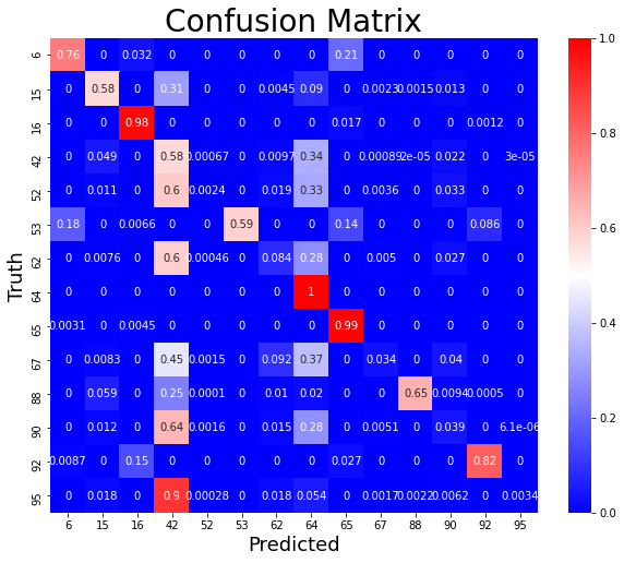
Figure 12: An example confusion matrix.
Accuracy can be deceiving in unbalanced classes. Say you have 1,000 rows and 990 are true, but it’s really important to properly classify those ten that aren’t as false. If accuracy is you metric, you can simply make a model that predicts y = 1 and call it a day with 99% accuracy.
Precision is the ratio of true positive results to the predicted positive results, or the true positive and false positives (also known as Type I error) combined. This tells us what percentage of the positive predictions were correct.
Recall is the ratio of positive predictions to all positive values, or the combination of true positives and false negatives (also know as Type II error). This shows us what portion of the positive results we captured.
On their own, precision and recall are deeply flawed metrics for evaluating a model. You could achieve perfect precision with a model that simply states y = 0, and perfect recall with a model that states y = 1.
This is where the F1 Score comes in. The F1 score is the harmonic mean between precision and recall and offers a balanced model score. Between the F1 score and the confusion matrix, it becomes easy to see how changes to model parameters impact performance.
XGBoost
XGBoost is a gradient boosted tree implementation.
A typical decision tree model like random forest aggregates multiple individual decision trees and has them vote on a solution. The ensembled models are fully grown decision trees trained in parallel and the results are averaged. There is low bias (error introduced by the model), but high variance (error from fluctuations in the training set). This means that the models are prone to overfitting, or memorizing the training data and not generalizing well to unseen data.
Gradient boosted tree models improve on the random forest concept by training the individual trees sequentially with gradient descent. It’s still an ensemble of decision trees, but with a much different strategy. The trees in gradient boosting are also not fully grown, but rather an ensemble of weak learners including stumps with a depth of two. These weak learners have high bias and low variance, but gradient boosting reduces the error due to bias.
The result is a powerful model that can fit to highly nonlinear data without overfitting, while having more describeability than black box algorithms like neural networks.
Training
model = XGBClassifier()
model.fit(X_train, y_train)
y_pred = model.predict(X_test)
I began the model training process by simply benchmarking the model on my initial engineered features (those described in the groupby_dic in the code block above) and the default parameters. It achieved a very strong performance of:
Precision: 0.7883 Recall: 0.8081 F1: 0.7867
Unlike the previous project in my independent study, which was an image description problem with clear data and the biggest impact to performance was optimization of the architecture of a neural network, this problem is messier and the biggest opportunity to optimize performance is in feature engineering.
After several rounds of feature engineering, I was able to achieve a 3.5% boost in precision, a little over half a percent boost in recall, and a 1.2% boost in the F1 score.
Precision: 0.8155 Recall: 0.8153 F1: 0.7964
Satisfied that I had found a good selection of features, I moved on to hyperparameter tuning. I did a random sweep of the features I believed would have the biggest impact on the model: the number of estimators, the max depth of the trees, and the gamma (a regularization parameter).
params = {
        'gamma': [0.5, 1, 1.5, 2, 5],
        'n_estimators': [100, 250, 500],
        'max_depth': [3, 4, 5]
        }
model = XGBClassifier()
skf = sklearn.model_selection.StratifiedKFold(n_splits=4, shuffle = True, random_state = RANDOM)
random_search = sklearn.model_selection.RandomizedSearchCV(model, param_distributions=params, n_iter=5, cv=skf.split(X_train, y_train), n_jobs=4, verbose=3, random_state=RANDOM )
random_search.fit(X, y)
The optimal selections were 1.5 gamma, 500 estimators, and a max depth of 5. Since the estimators and depth were at the edge of the parameter grid, I repeated the experiment twice taking one extra step for each parameter and saw performance decrease. Therefore, the final parameter grid was:
params = {'gamma':1.5,
          'max_depth':5,
          'n_estimators':500}
The result? A 4.5% boost in precision, a 1.7% boost in recall, and a 2.2% boost in F1 score.
Precision: 0.8239 Recall: 0.8221 F1: 0.8038
Let’s take a look at the confusion matrix to see how this breaks down in terms of accuracy across target classes.
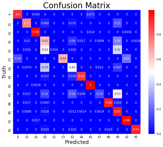
Figure 13: Confusion matrix illustrating the performance of the final model.
We can see a mix of performance across classes. Some perform very strong, while a few are not captured well. This actually presents an interesting problem, and many participants in the Kaggle challenge struggled with these as well.
In machine learning problems, not every class or cluster of data is guaranteed to be well suited for the same model. The solution to this is ensemble models, training multiple different types of models on either the full dataset or clusters of the data and having another model trained on the output. To see an example of ensembling and stacking, you can check out my entry in the Mercari Price Prediction Challenge where I used a boosted tree model on the output of another boosted tree and a linear regression model to get about 7% better performance than either model individually.
There is a fundamental tradeoff in machine learning between the complexity of a model, in terms of not only Big O and computational overhead but also the engineer’s time and expertise, and the performance of the model.
For this project, I’m happy with this single model performance and it was a great exercise in feature engineering.
Closing Thoughts
This was a fun project and I significantly expanded my skill level with Pandas and feature engineering, and I also learned a new gradient boosted tree library.
And even though it didn’t make the cut, I gained a deeper knowledge of recurrent neural networks and time series data pipelines in PyTorch. I’m looking forward to applying that knowledge to new problems with data better fit to that strategy.